Archroma provides proof of sustainability
A sustainability report in which form and content match and which is completed in the shortest possible time. That's what we accomplished for our customer Archroma.
Publications for global distribution
Since 2013 we have the honor to create design works for Archroma: Flyers, fact sheets, color cards, posters, brochures, roll-ups, advertisements, and the like. The text is always in English, and during the realizations, it must be considered that the final product will be distributed worldwide and work in other cultural contexts.
Sustainable specialty chemicals
Archroma, headquartered in Pratteln, Switzerland, is a globally active company in specialty chemicals for the textile, packaging, paper, coating, adhesives, and sealants sectors. This is a typical B2B market. Archroma's substances are used to dye materials and create effects such as crease resistance, softness, durability, dimensional stability, water impermeability, or antistatic properties of textiles. An essential focus of the company is conserving resources and avoiding energy and water consumption while optimizing costs. Archroma is also committed to the Sustainable Development Goals (SDGs): The UN has defined 17 sustainable development goals that its member states should achieve by 2030. More and more companies are also aligning themselves with these goals, including Archroma.
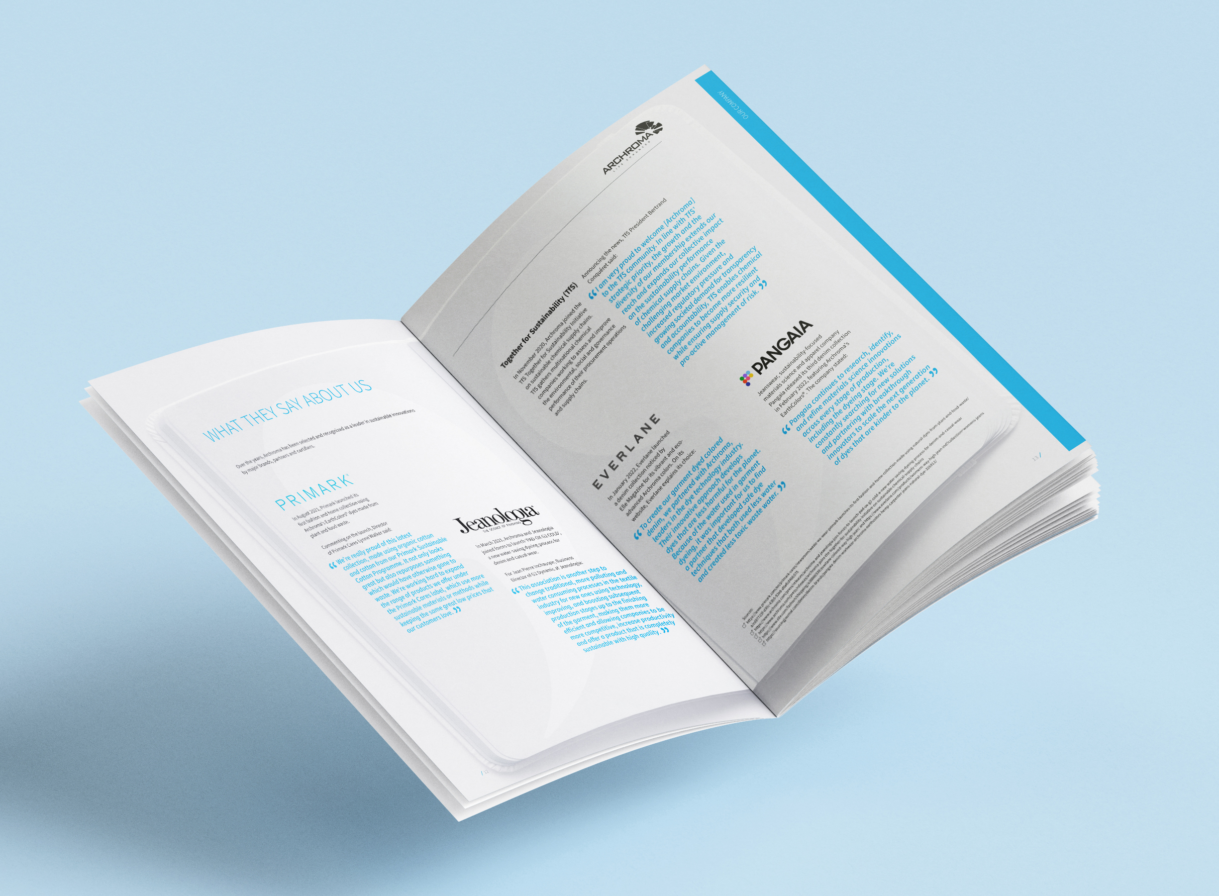
Sustainability - also in the customer relationship
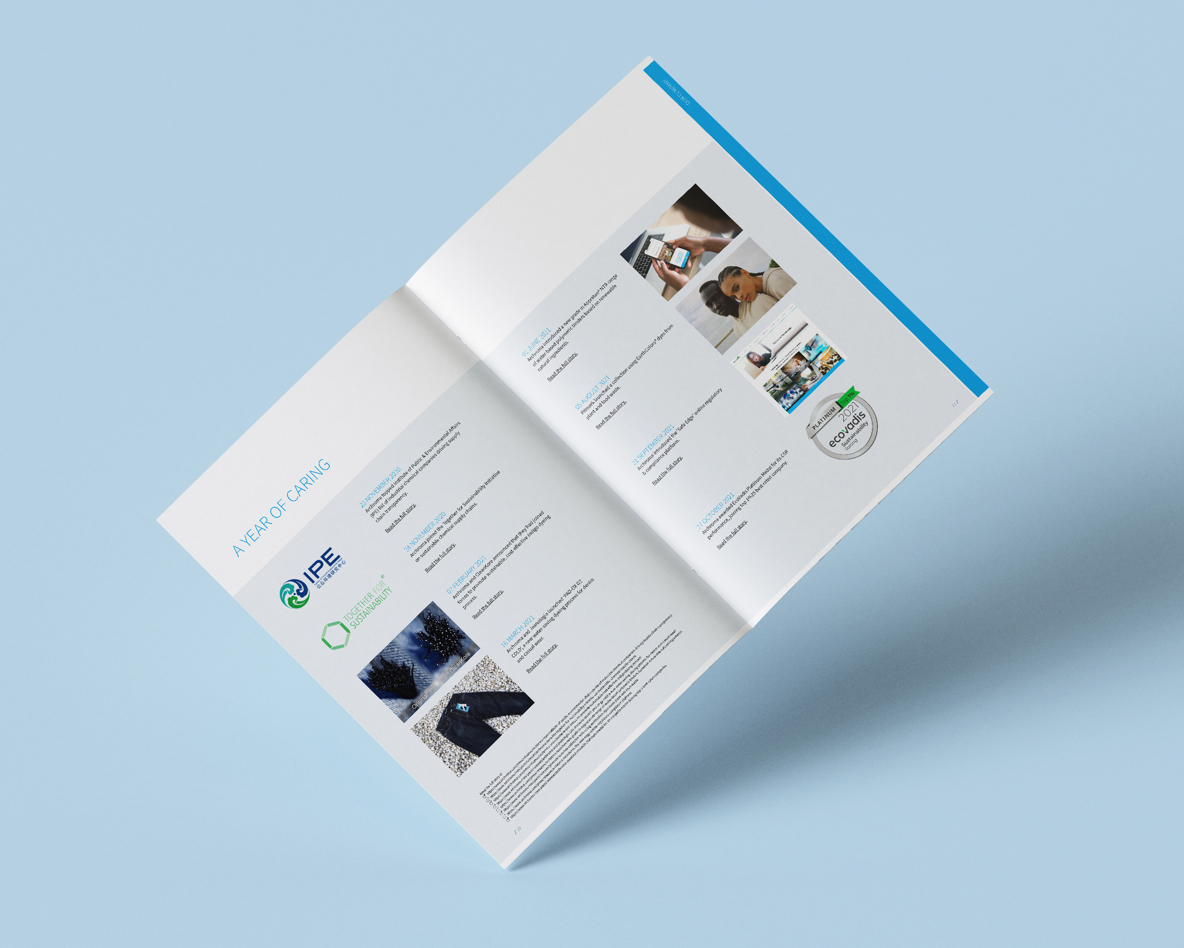
Every year we may create the sustainability report for Archroma. We proposed a concept based on the corporate design and corporate identity, designed the layout, and developed the appearance of graphics to match. Since the development of this basis, we execute the 110-page publication, distributed globally, very quickly every year.
Color codes and icons for orientation
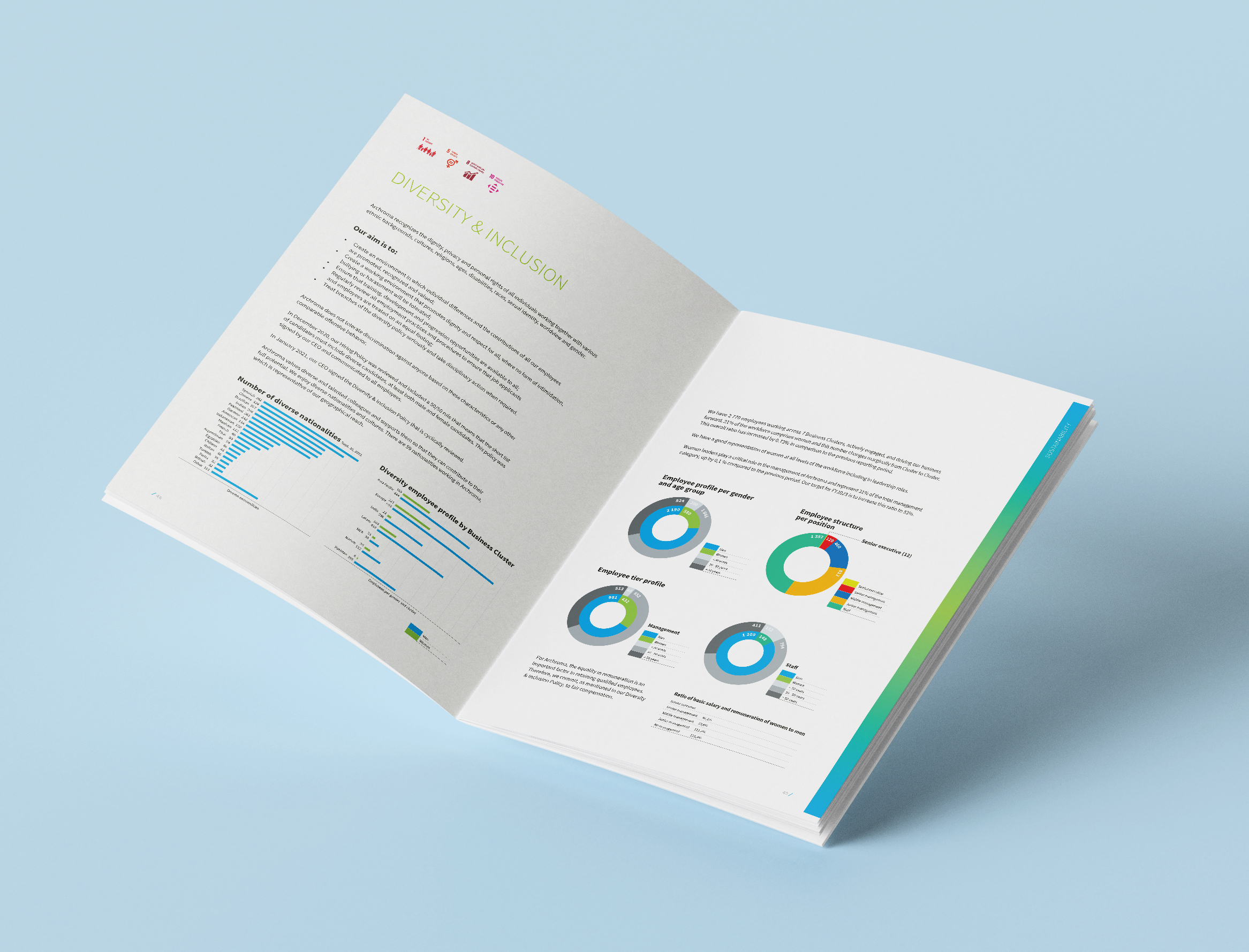
According to Archroma's core business, the colors, a color code supports orientation in the extensive document - in line with the principle of unity of form and content. Green and blue dominate the color scheme of the Archroma logo and underpin the emblem. Portraits of employees visually and in terms of content reinforce that sustainability is ultimately in their hands. Expansive, colorful surfaces and images allude to Archroma's core business and lend the publication generosity and calm. In contrast, icons such as those of the Sustainable Development Goals relate Archroma's activities to this field.
Contact us!
In our eyes, Archroma's sustainability report stands for a sustainable collaboration with this global player.
May we support you with design services, graphic, or layout work? Contact us without obligation.