These colors has health
How does Schaffhausen keep fit? By visiting eurofit, for example. It is well established in the region. Its name is associated with the best quality and highest competence. In response to customer needs, it has expanded its range of services, remodeled its premises, and repositioned itself accordingly. This sets it apart from conventional fitness centers.
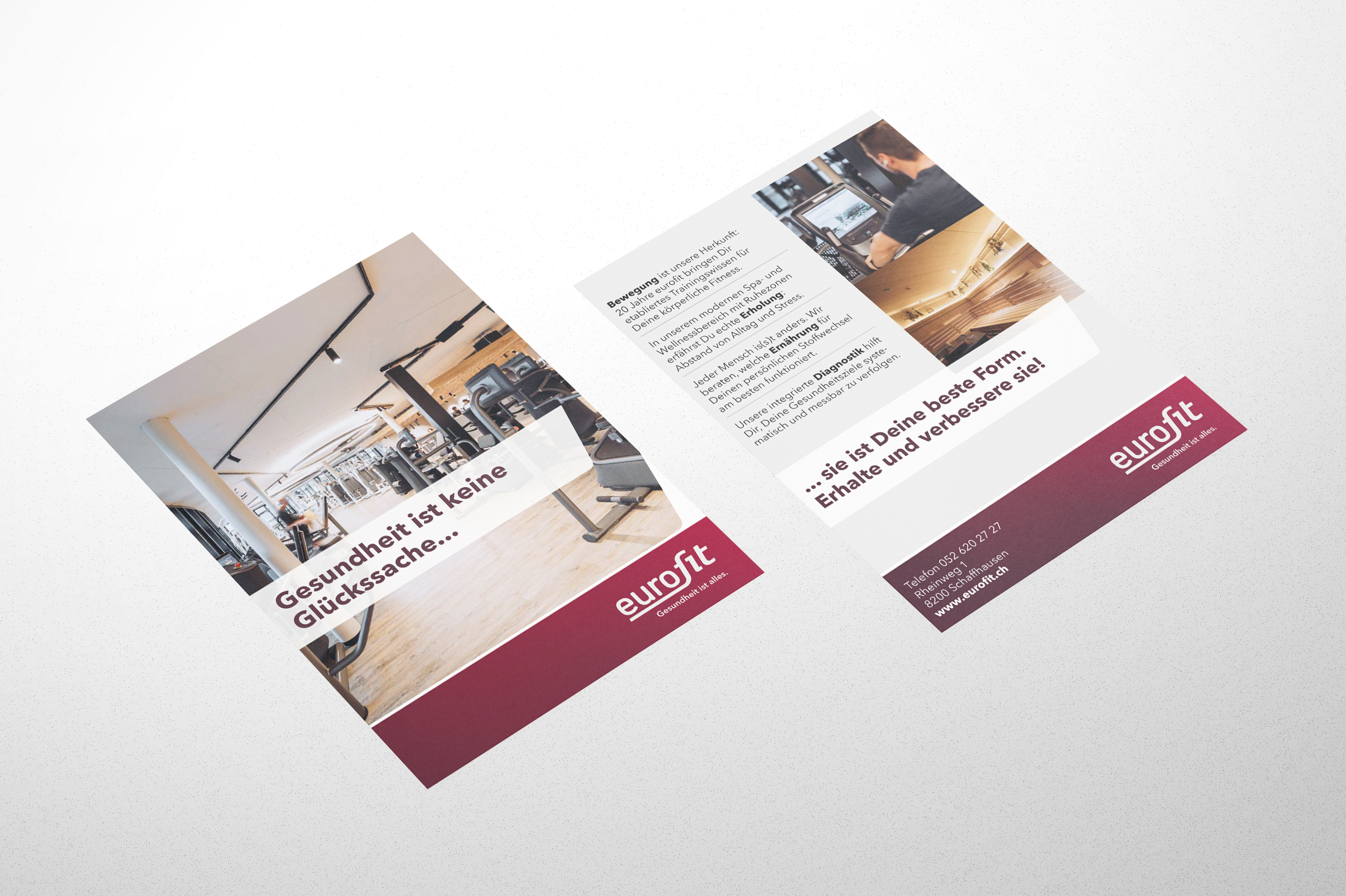
The motto of eurofit is "health to the power of 4". Because movement, strength, and fitness training are only one aspect of four for health: Depending on the disposition, physiotherapy is also part of it. Correct nutrition and suitable, holistic measures such as those from traditional Chinese medicine have a complementary effect. Careful diagnostics and the client's objectives form the basis for customized programs. eurofit adapts the latter to the needs and status of its clients at regular intervals.
Brand management, online measures, print
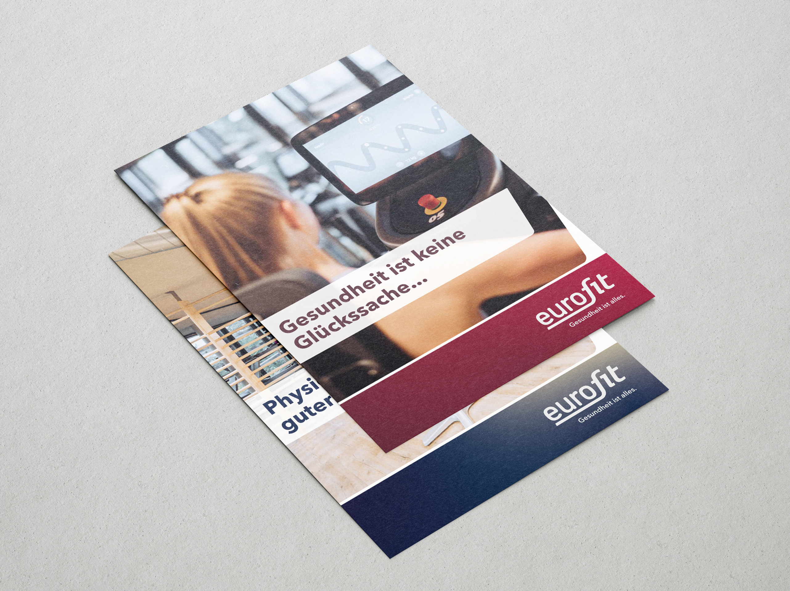
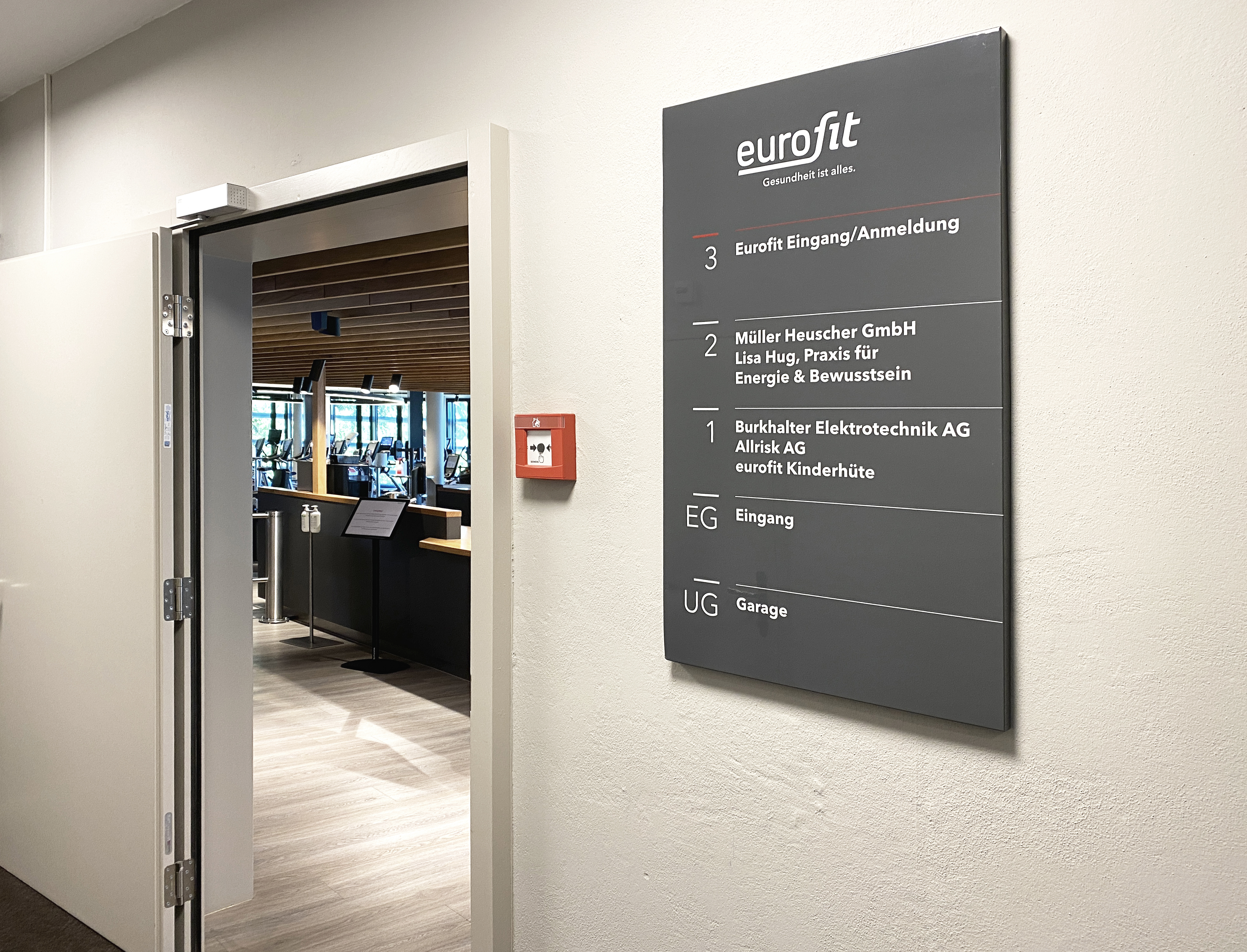
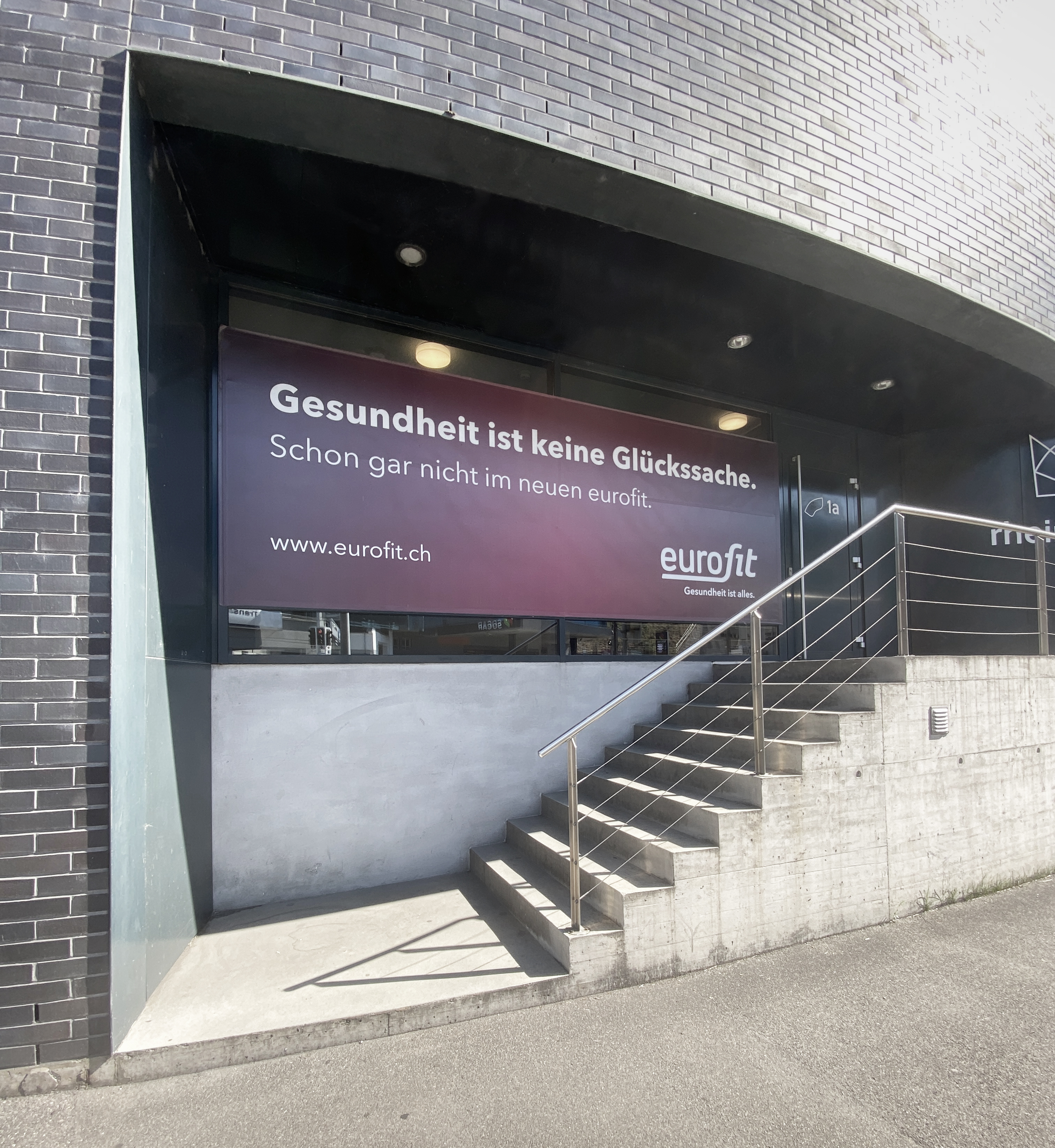
We also addressed the status, goals, and needs when eurofit commissioned us with rebranding, i.e., brand management, corporate design, and corresponding implementations. The task was to transform the new positioning into an understandable and emotionally appealing and coherent communication, as well as to adapt it to all channels. This meant revising the logo, creating a new corporate design, developing signaling, initiating social media, relaunching the website, and designing flyers. A solid business plan for a new business idea is half the battle. But the other half is credible, congruent, and emotionally appealing communication.
Target group analysis for specific measures
A careful target group analysis is an essential prerequisite for communication success. It allows for derivating communication goals, messages, measures, and the brand promise. The reduction from the latter is the claim. In the case of eurofit: "Health is everything."
Which colors symbolize health, match eurofit's values, and appeal to the target audience? Together with our client, we decided on a palette with vibrant colors that show strength: Pulse Red, Granite, Beach Run, and Cherry Blood are their names, for example. We reworked the logo so that it exudes momentum, clarity, and strength at the same time.
Website: Mobile first
The statistics on the eurofit website showed us that up to three-quarters of the users access it via mobile. Therefore, we decided to take the mobile website as a starting point and create the desktop version only afterwards. Since touch logic is predominant in the mobile version, the desktop version now looks very different. Mobile first in the truest sense of the word.
Are you stuck with a question about your brand?
Are you seeking assistance in establishing a new brand, changing an existing brand - or gaining reach with your brand?
We have the answers and, above all, the necessary expertise in branding, brand management and corporate design.
We look forward to any direct exchange with you.