Bright prospects for Graf & Partner
Around Schaffhausen is easy to find a real estate company. There are a few that share the business. Therefore, it needs unique attributes to stand out and be successful:
An excellent reputation that has grown over the years, regional roots, experience, knowledge of the subject matter, and trustworthiness are the basis. Our client Graf & Partner has it all. But despite its excellent starting position, it has to do marketing, of course. Customers have to remember that the company exists. The brand must be maintained, and the image adapted to the spirit of the times.
The values, i.e., the entire brand, must also be critically and carefully scrutinized, reviewed, and possibly revised at intervals of years. We redefined the brand on behalf of Graf & Partner.
Brand management: values, internal and external perspective
In a company that has existed for years, values are already in place. Unconsciously or consciously. Branding consulting, therefore usually consists of bringing values to light, making them conscious or formulating them. In some cases, it is necessary to check whether the internal and external views coincide, i.e. whether the supposed values and those perceived from the outside are congruent. Or whether there is a gap, i.e. a difference between the internal and external perspectives. We systematically examined the resources and strengths of Graf & Partner Immobilien and formulated its values.
Claim: Condensing values, resources, and strengths
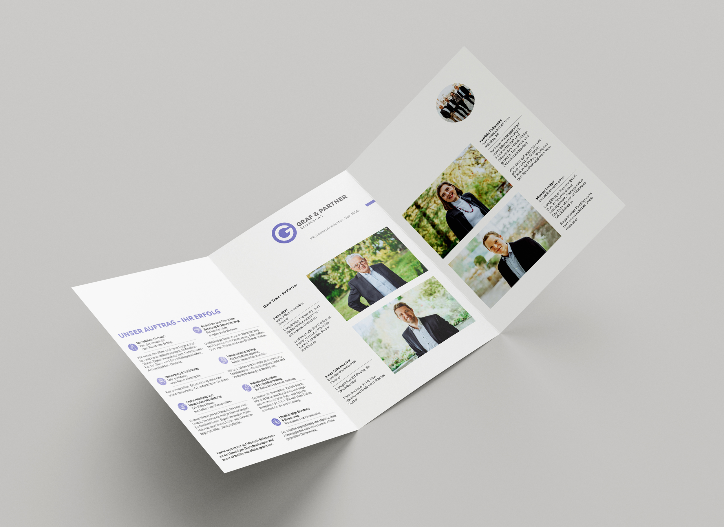
The resources and strengths certainly include the distinctive personality of the company founder Hans Graf with his instinctive business sense, his extensive network, and his broad know-how.
Important for the company are values such as consistency, quality, diversity, and security. The company's focus is always on the needs of the customer and the corresponding transparent advice. Their personality is taken into account, and they are treated with respect at all times.
The services of Graf & Partner are characterized by legally, financially, and organizationally well-thought-out support. They offer an all-around carefree package.
We condensed all this information into the claim: "With the best prospects." Because ambiguity and a twinkle in the eye suit this company so well.
Based on what we had worked out, we designed the measures.
Find to the shape and color of the corporate design
The following criteria were decisive for us in defining the measures and the revised corporate design:
- Conspicuousness/stand out
- Clarity/Transparency
- Seriousness/quality
- Self-confidence/competence
- Ambiguity/freshness/vibrancy
- Closeness to existing design/Recognizability
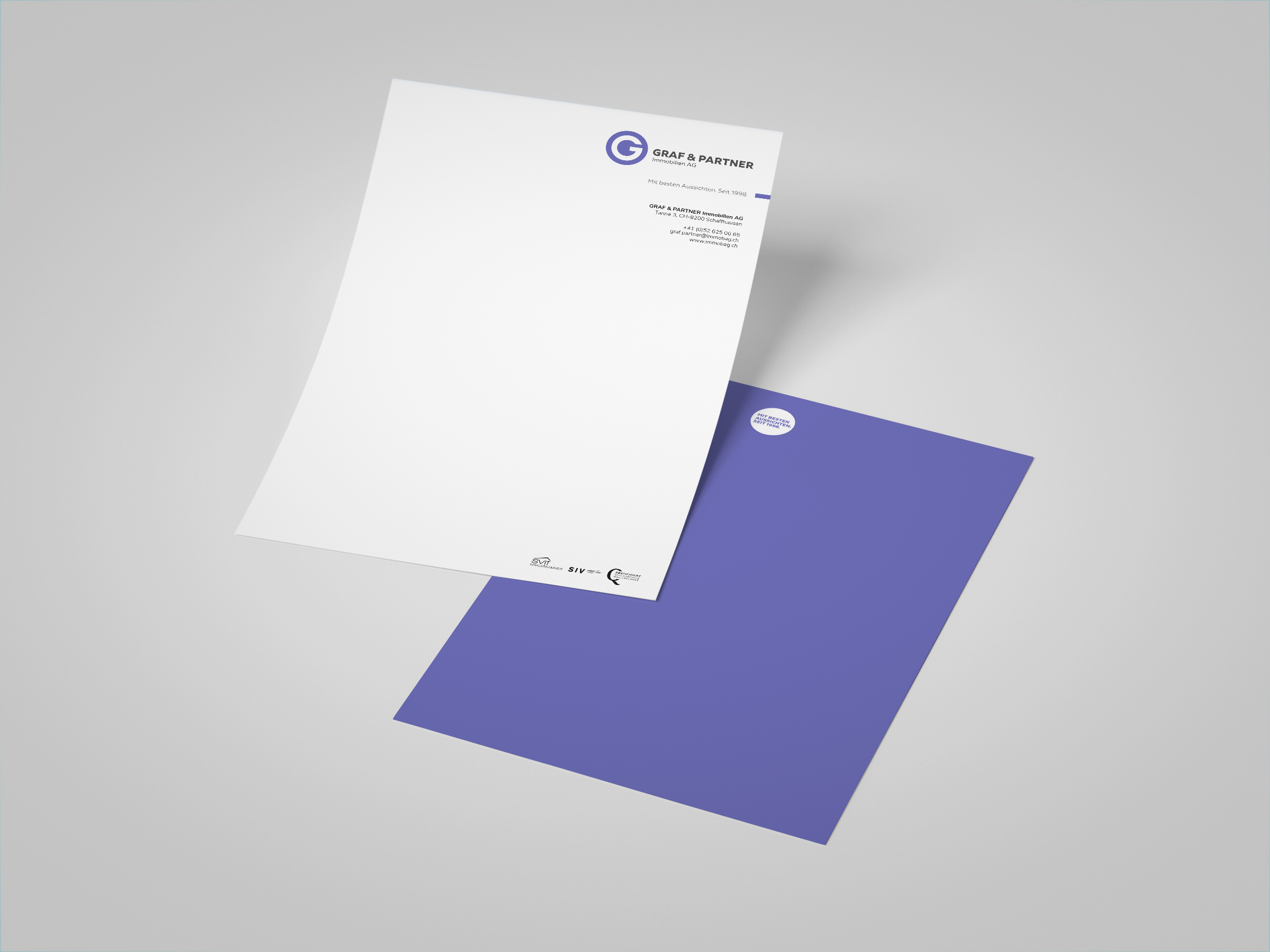
We retained the purple color because it ensures continuity and meets the criteria of conspicuousness, liveliness, and freshness.
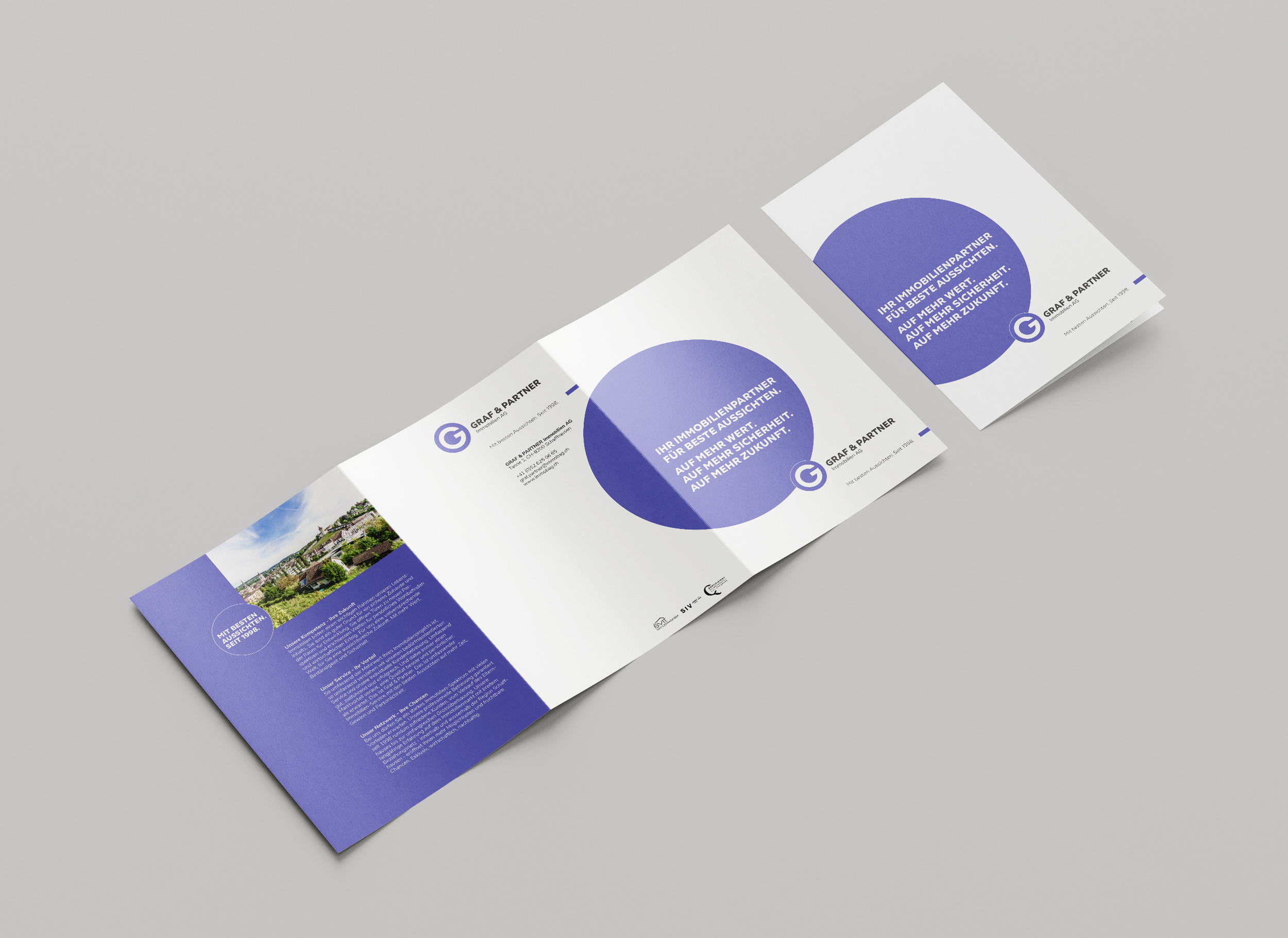
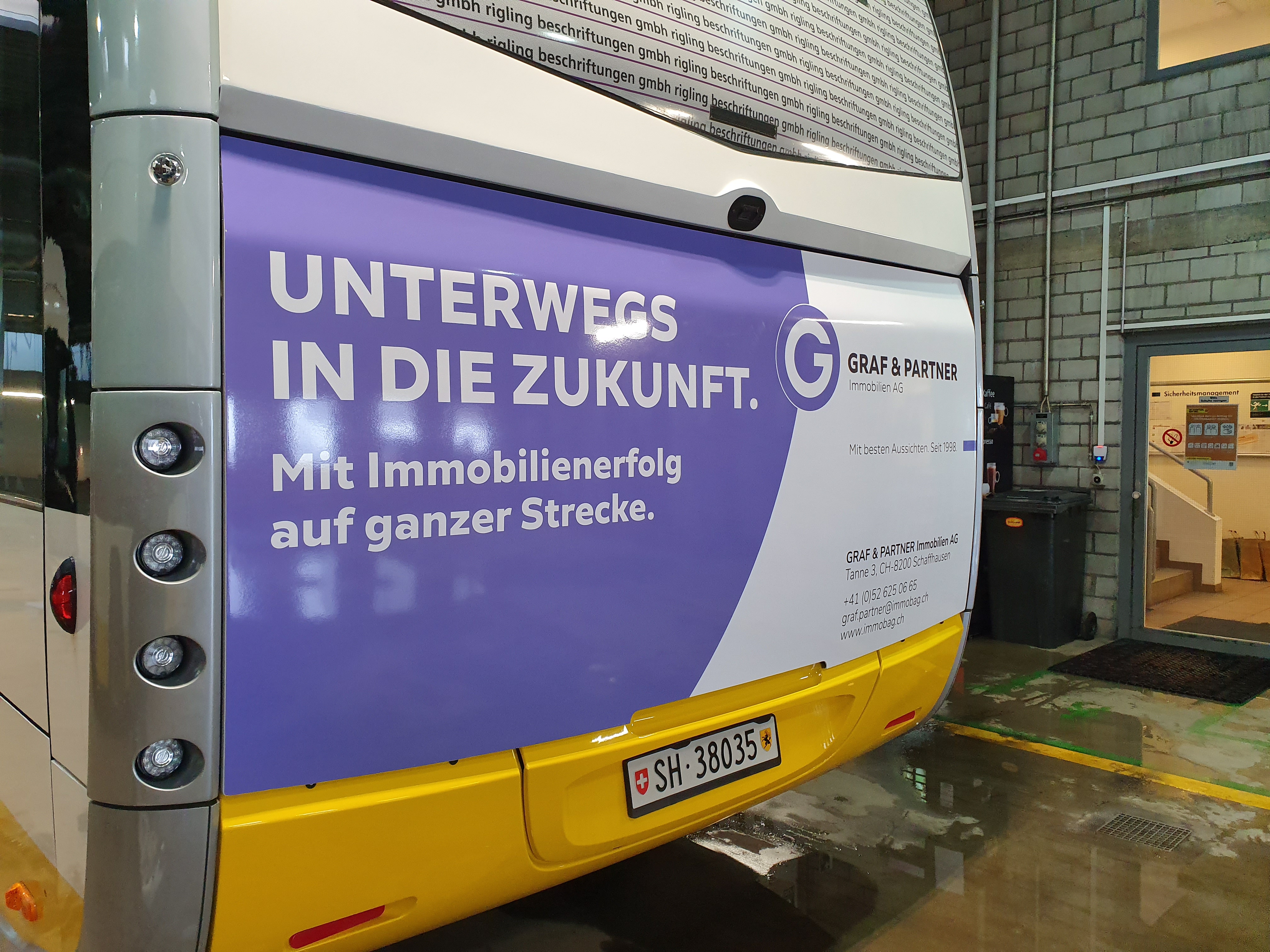
We associated the initial G, like Graf from the existing logo, with a circle and backed the white letter with this shape in purple; this conveys clarity and seriousness. We took up the circle again as a decorative element, but mostly so huge that the center is outside the available space. This looks cheeky, fresh, and self-assured but does not call the seriousness into question, as we consistently pull off this element.
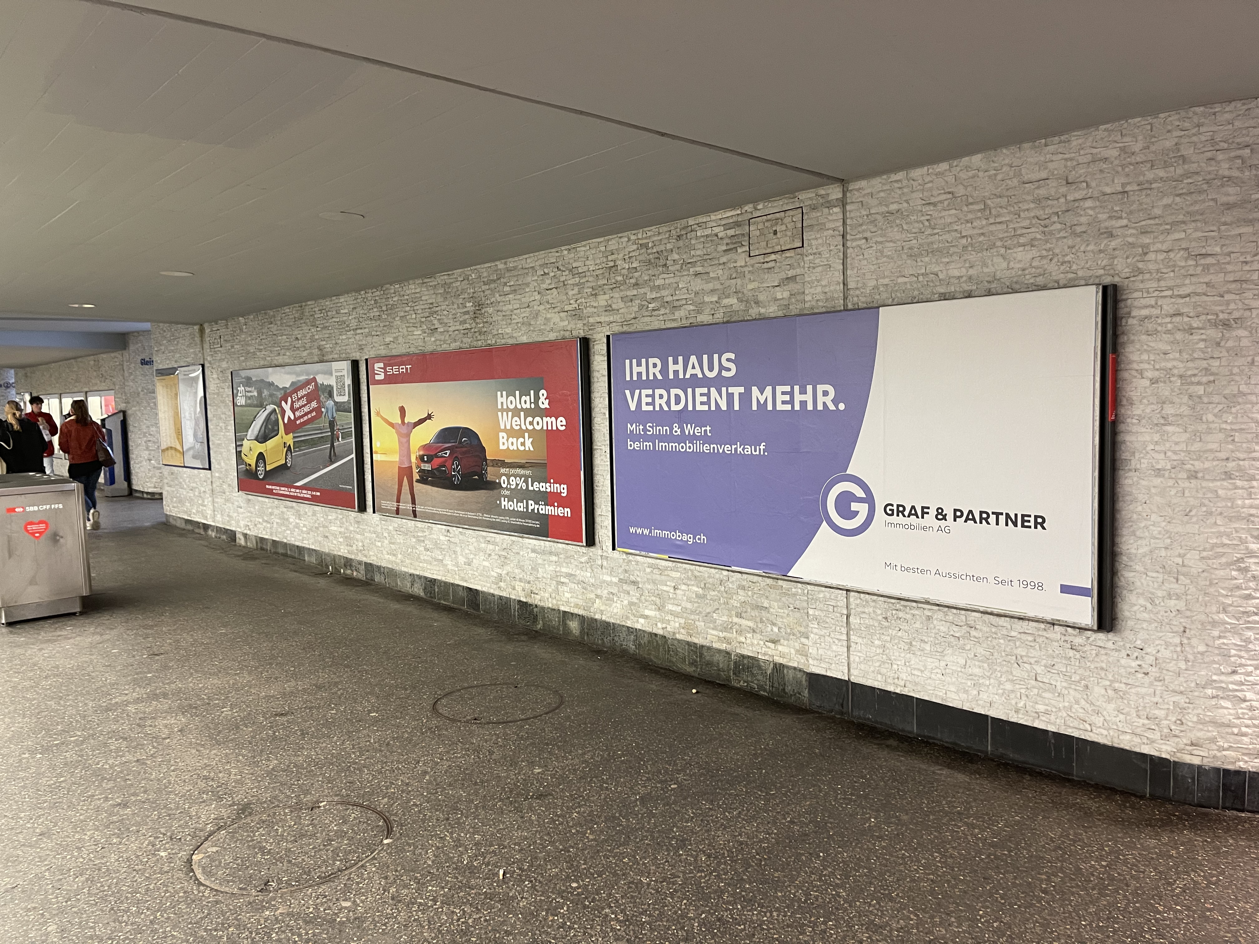
Large, graphically designed posters acted as an attention magnet. The same was true of the local buses.
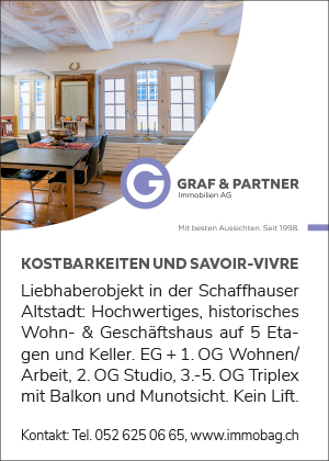
We also designed the stationery, the company brochure, and advertisements for the new look. The eccentric circle served us again and again as a form-giver. In the booklet, we used a punched-out circle to illustrate transparency. In the advertisements, the pictures had the shape of eccentric circles.
To our delight, the new design was also adopted for the partner company in Winterthur. Therefore we think we have brought the design to the point.
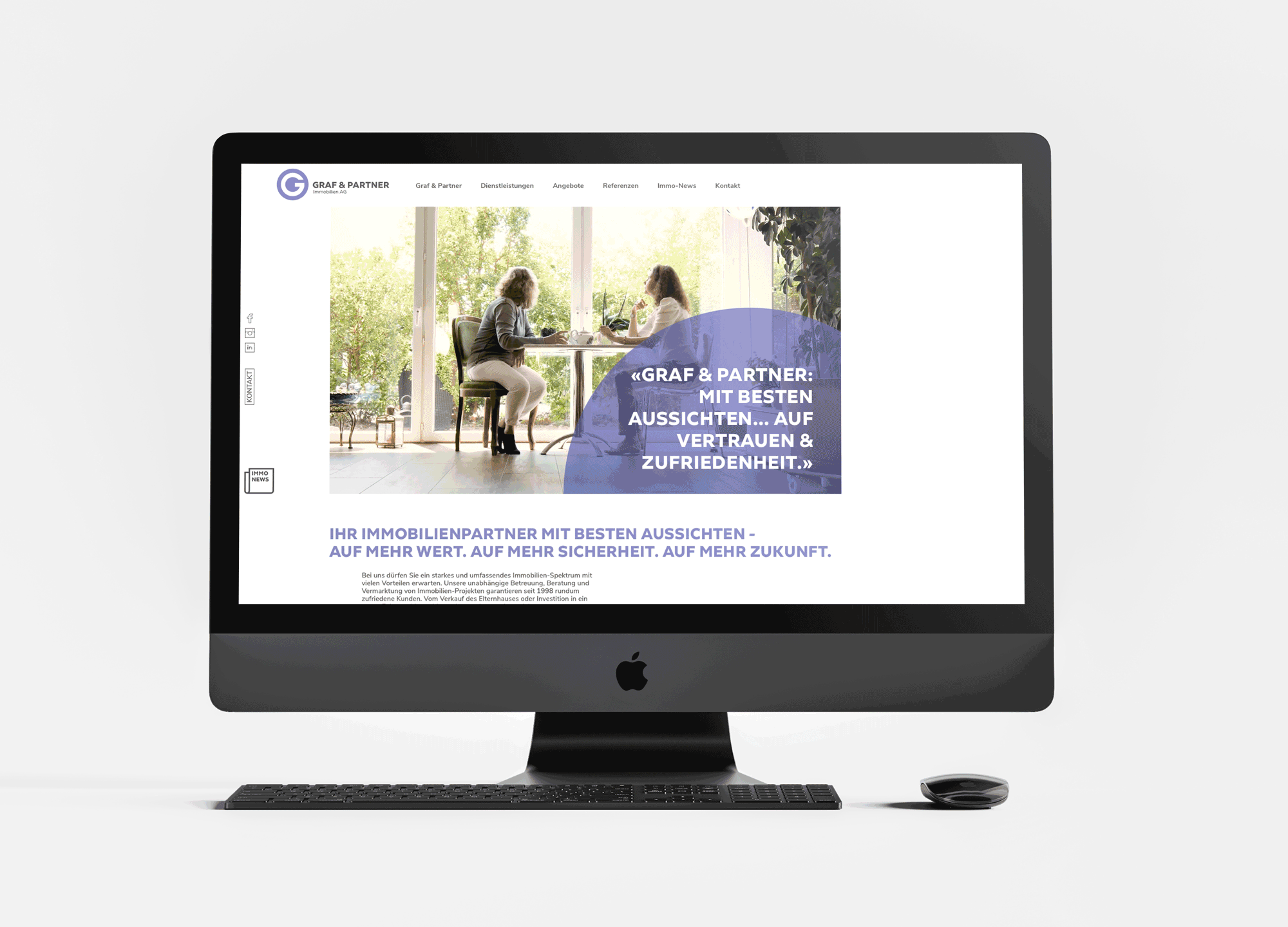
Website as mother ship
A website is something like the communicative mother ship of a company. It offers the possibility to present networks and engagements and to integrate multimedia elements. And that's exactly what we did - always with the circle in the toolbox. This time in transparent purple - mindful of one of Graf & Partner's important values: transparency.
If you would like to take a look for yourself on the Graf & Partner Immobilien AG website: www.immobag.ch
Branding Experts
Do you need a consistent image that reflects the core of your business? We would be happy to develop or revise your CD and bring your CI to the point. Contact us for a free initial consultation.